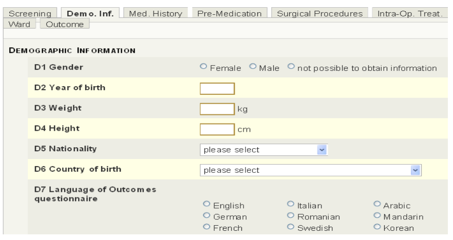
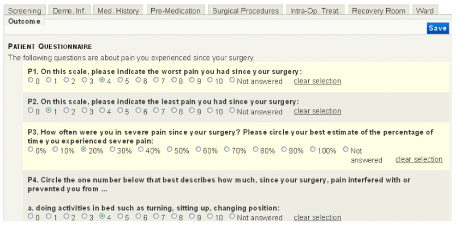
Here are some exemplary screenshots from the PAIN OUT system:
First, you see the data entry mask with the tab for demographic information of the patent.
The second image shows parts of the entry mask for patient outcome data.
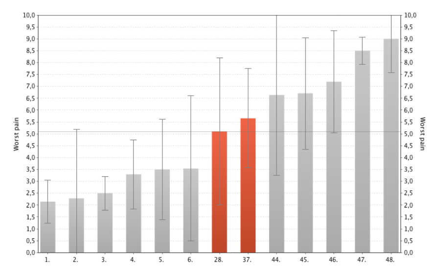
Here are three screenshots from our benchmark server. The first one shows a bar graph of the mean of maximal pain. Red bars represent wards of your own hospital while grey bars represent anonymized wards in other hospitals. Our red wards and thus our mean average maximal pain are in the middle of the presented group.
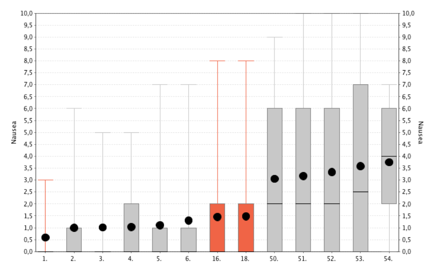
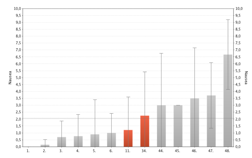
The following image illustrates the mean nausea levels as reported by the patients. Again, our wards lie in the middle. However, big differences can be seen in the anonymised wards.
The last image shows another type of graph, the box-whisker graph, which you can also choose as feedback. It gives some further imformation about the distribution of your patients.